모두
← Back to Squawk list


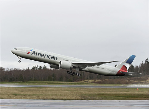
American Airlines New Logo, Branding, Livery
American Airlines unveiled a new logo, branding, and livery, which will debut on their new Boeing 777-300ER deliveries. (www.aa.com) 기타...Sort type: [Top] [Newest]
Not bad. Kept the eagle, AA combinaton in a nicely updated way. The gray paints kinda wander into United territory. I've always thought the American bare metal was way classy. (Somebody on this stream does raise the question of bare metal when American/USAir add 787s to the fleet, since the metal won't be there and carbon fiber isn't shiny...)
I thought it was hard to tell...is it showing as gray, which I would strongly object to...or still staying good old silver, which made it stand out among all the others. I one time heard that the paint actually added significant weight (and more fuel consumption...is that true? I think that was from back in the Crandall days....
That rendering would have looked good!
Very nice. Modern with AA continuity. Why didn't AA pay this guy and save a bundle instead of the dreck that they paid big-bucks for?
Yea, I agree with you. I personally don't like any of the new liveries anyone released, especially Iberia's new livery. I do, however, like that guy's take on a ne livery for American.
Much better than what was announced.
http://anthony-harding.com/wp-content/uploads/2012/05/L-AA1.jpg