Back to Squawk list
  • 32

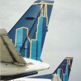
United/Continental's new color scheme rolls out!

제출됨
 
United/Continentals merger color scheme rolls out on its first revenue flight! Check it out! (www.airliners.net) 기타...

Sort type: [Top] [Newest]


Benav8r
Benav8r 0
I think it's awful! "u n i t e d".....so plain.
amiee
Ken Martin 0
I like the new clours of UNITED/CONTINENTALS it is clean bright and fresh looking for a change better than being drab and boring.
pfp217
pfp217 0
ywah I'd hardly call it a "new color scheme". Most airlines roll out retrojets and special schemes that are much more of a change than this.

Ok, we've got the aircraft covered and taped and ready to paint. Ok, step 1, put the decal over the Continental title. Ok, done, roll er out!
mperry
I think the new livery is simple and clean, the only thing I would change the lower half of the fuselage the continental blue and not gray. Sometimes simple is the best way to go.
kangforpres
It's not butt ugly but it is pretty plain, oh well let's hope the new mega airline has better service than looks
aviation93
so is there no more "continental" jets?
pfp217
pfp217 0
With what I said above I should include that the CO scheme is one of my favorites of all time, it just doesn't seem the same now.
Matt you'll see "Continental" aircraft for a while just as you'll see Tulips still tiptoeing though the airport for sometime to come. In fact I'll bet it takes a long time for some of the UAX companies to get the CO colors w/ UA titles applied.
UAL047
UAL047 0
While I like the concept of combining the two liveries, there really isn't much combining here at all. It's CO's scheme and a changed font for UNITED. It's rather poorly done. It is my opinion that they could have used the existing UA font on the CO colors and it would have been fine; the only difference being a color change from black to the royal blue that CO uses on its birds. Also, I agree with Michael Perry; painting the underside of the fuselage and engine pods blue would have given it a more refined look.

I suspect, as anything else, this will be a work in progress. If I had to guess, what you see today will not be the final product that comes out when the carriers finally become one in 18-24 months time.
bobbyjoh
The new livery in my opinion is what the OLD United and Continental were trying to accomplish, a blending of the two airlines. It is not some stupid dazzling new colors that mean nothing, but a meshing of two great airlines. I think they did a superb job in blending the two.
ryanna924
I have always loved Continentals colors, so I'm glad I will be able to see the "globe" in the future.
N3434L
i like the font
amiee
Ken Martin 0
I am glad to see some people like plain and simple coulor schemes whether it be on aircraft or what ever, I still think it looks good on United/Continental planes.
pentatp
THIS IS AWFUL!!!
rdeeringer
It is a good thing, not spending a lot of money on cosmetics. Maybe they can pay the air crews enough to keep the customers happy and returning. Today's airline game is not about how pretty or flashy the outside looks, it's all about service and price. Sometimes price comes first, but those are the vacation flyers who fly once or twice a year. The bread and butter is the folks who have their butts in a seat once or twice a week.
butchwhitmon
Simple is fine. Looking good United/Continenal
pentatp
United needs to keep their main livery and put continental on the nose small
chalet
chalet 0
The Continental logo is very neat but now they should remove the golden stripes around the world with red color.

로그인

계정을 가지고 계십니까? 사용자 정의된 기능, 비행 경보 및 더 많은 정보를 위해 지금(무료) 등록하세요!
FlightAware 항공편 추적이 광고로 지원된다는 것을 알고 계셨습니까?
FlightAware.com의 광고를 허용하면 FlightAware를 무료로 유지할 수 있습니다. Flightaware에서는 훌륭한 경험을 제공할 수 있도록 관련성있고 방해되지 않는 광고를 유지하기 위해 열심히 노력하고 있습니다. FlightAware에서 간단히 광고를 허용 하거나 프리미엄 계정을 고려해 보십시오..
종료